
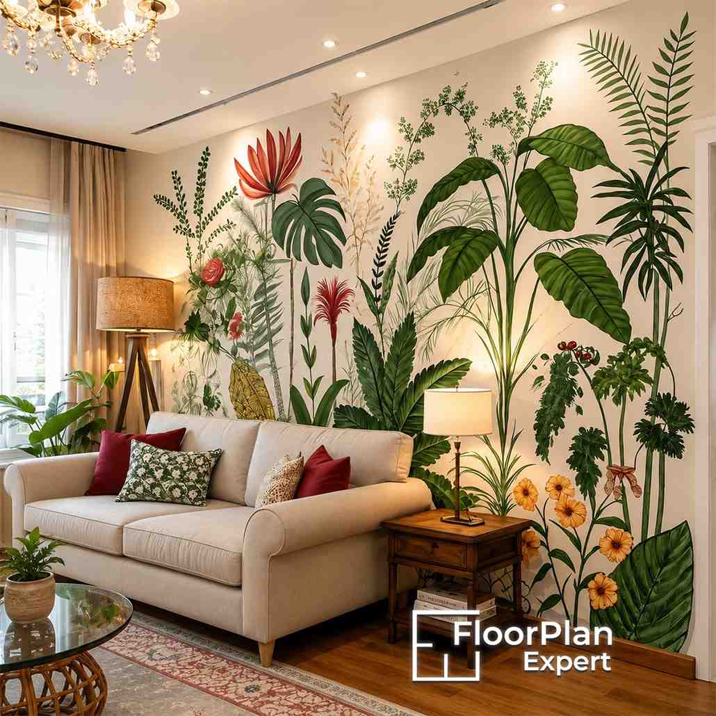
The most effective wallpaper and paint ideas are built on thoughtful planning rather than choosing colours separately. Every element from deciding which wall should feature wallpaper to coordinating patterns, tones, and finishes should contribute to a unified design. Well-planned interior space planning ensures that wallpaper complements the room without overpowering it, while carefully selected paint colours bring the entire interior together in a cohesive and balanced way.
A common mistake many homeowners make is selecting a wallpaper they like first and then searching for a paint colour afterwards. Although this might seem like the easiest approach, it often results in colours that don’t blend naturally because they weren’t chosen as part of the same overall design scheme.
Another frequent issue is trying to make every wall a focal point. When multiple bold colours and eye-catching patterns compete within the same room, visual balance is lost, causing even well-decorated spaces to feel crowded and unfinished.
Professionally designed interiors feel harmonious because every wall, finish, and decorative element works together to support the overall design instead of competing for attention.
The easiest way to keep wallpaper and paint working together is to allow the wallpaper to guide every colour choice throughout the room.
Instead of introducing an entirely different paint colour, choose one of the secondary or supporting shades already found within the wallpaper design. Doing this creates an immediate sense of harmony because both finishes share the same colour palette and naturally complement one another.
Every wallpaper design contains a combination of dominant colours and more subtle supporting shades. While most people instinctively focus on the boldest colour, interior designers often select one of the softer background tones and use it as the paint colour for the surrounding walls.
This technique creates wall color combinations that feel balanced, cohesive, and intentionally designed rather than forced. Instead of competing with the wallpaper, the painted walls provide a subtle backdrop that enhances the feature wall, allowing it to remain the main visual focus of the room.
Choosing the Right Wall for Wallpaper
Not every wall is the right choice for wallpaper. Applying it to the wrong surface can upset the visual balance of a room, no matter how attractive the design or pattern may be. The most successful interiors begin by identifying the wall that naturally captures attention as soon as someone enters the space.
Effective interior space planning goes beyond selecting colours and finishes, it considers how people naturally experience and move through a room. The placement of wallpaper should support the overall layout instead of competing with it.
Before deciding which wall should become the feature, designers typically assess:
- The first sightline when entering the room.
- The direction and quality of natural light.
- Furniture layout and positioning.
- Existing architectural features.
- The proportions and shape of the room.
Evaluating these elements together helps ensure the wallpaper complements the room’s overall design, strengthens its layout, and creates a space that feels visually balanced and thoughtfully planned.
How Wall Color Combinations Work With Pattern
Once you’ve selected the wallpaper, the paint colours around it should enhance its overall appearance rather than compete for attention. The objective isn’t to find an identical colour match but to create a balanced relationship between patterned surfaces and plain painted walls, allowing each element to complement the other.
One of the most effective ways to create harmonious wall color combinations is by choosing a subtle shade that already exists within the wallpaper design. This could be a muted green, soft neutral, warm beige, gentle blue, or another understated tone that sits quietly behind the main pattern.
Using that colour on the surrounding walls creates a consistent flow throughout the room while allowing the wallpaper to remain the primary focal point. Rather than introducing completely different shades, working with colours already present in the wallpaper palette results in an interior that feels more cohesive, refined, and visually balanced.
Many modern home interior design ideas focus on simplicity and restraint instead of combining numerous bold design elements. Rather than filling a room with multiple strong colours and patterns, designers often feature one statement wallpaper alongside subtle painted walls and understated furnishings to achieve a polished look.
This layered design approach allows textures, artwork, decorative accessories, and furniture to add character without making the space feel overcrowded or visually overwhelming.
Professional interiors often incorporate:
- A single feature wallpaper.
- Soft paint colours that complement the wallpaper.
- Natural materials such as timber or stone.
- Matching metallic finishes throughout the room.
- A restrained palette of accent colours.
The finished space feels cohesive and well-balanced because every design element supports the overall scheme instead of competing to become the centre of attention.
When One Wallpapered Wall Is Enough
Wallpaper has the ability to make a strong visual statement, but covering every wall isn’t always the most effective design choice, especially in smaller rooms where excessive pattern can make the space feel more confined. In many cases, a carefully placed feature wall creates a greater impact while maintaining a bright and spacious atmosphere.
Applying wallpaper to just one wall introduces character and visual interest without overwhelming the room. The remaining painted walls provide a sense of openness, allowing natural light to bounce around the space more effectively and creating a lighter, more balanced interior.
Among the most effective wallpaper and paint ideas, a feature wall creates contrast while preserving the overall feeling of space. It draws attention to a specific area without allowing bold patterns to dominate the entire room.
This approach works particularly well in:
- Small bedrooms
- Home offices
- Narrow living rooms
- Hallways
- Dining spaces
In many situations, a single wallpapered wall creates a stronger and more elegant design statement than covering every wall with the same pattern.
Good interior space planning ensures that decorative finishes complement the size and proportions of a room rather than making it feel smaller or more crowded. Every design choice should support the layout and enhance the overall sense of balance.
When designing compact spaces, professionals carefully evaluate:
- The scale of the furniture
- The proportions of the walls
- The location of windows
- The amount of natural light available
- The visual weight created by wallpaper patterns
Considering these elements together helps determine whether a room will benefit most from a single feature wall or whether a more extensive wallpaper application is appropriate for the space.
Colour Temperature Decides Everything
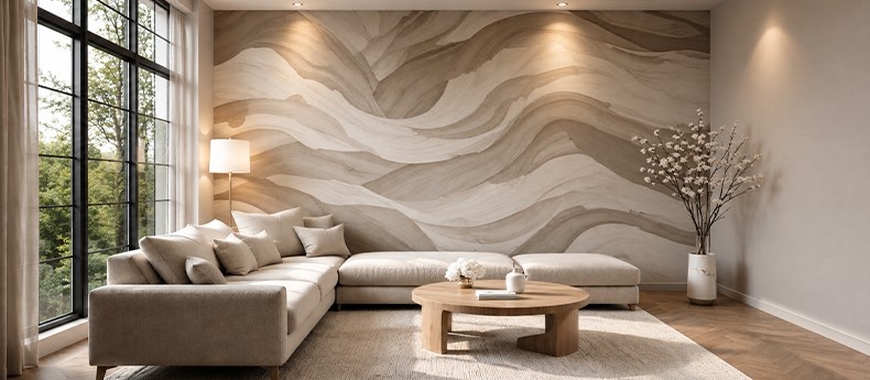
Two paint colours may look almost identical on a sample card, yet create completely different impressions once they’re applied to a room. This difference comes down to colour temperature—the subtle warm or cool undertones within a colour that have a significant influence on the mood, comfort, and overall appearance of a space.
Colours with warm undertones, such as hints of yellow, beige, or red, tend to create interiors that feel cosy, welcoming, and comfortable. In contrast, colours with cooler undertones, including shades of blue or grey, usually produce a cleaner, calmer, and more refreshing environment.
Neither warm nor cool palettes are universally better; the right choice depends on the style and atmosphere you want to achieve. However, combining warm and cool finishes without a clear design strategy can result in a room that feels visually disconnected and lacking in harmony.
One of the easiest ways to create balanced wall color combinations is to ensure that all the colours used throughout the room belong to the same temperature family. Keeping undertones consistent allows different shades and patterns to work together naturally without creating visual conflict.
For example:
- Warm wallpaper paired with warm neutral paint.
- Cool grey wallpaper combined with crisp cool whites.
- Soft sage wallpaper complemented by muted green paint.
- Beige botanical wallpaper matched with warm cream walls.
Maintaining consistent colour temperatures helps every surface feel connected, creating an interior that appears cohesive, well-balanced, and professionally designed, even when multiple colours and patterns are incorporated into the space.
How Pattern Scale Affects Paint Choice
The scale of a wallpaper pattern plays an important role in determining how the rest of the room should be styled. Larger patterns naturally become the centre of attention, while smaller prints introduce texture and detail without overpowering the space. Pairing a pattern with the wrong paint colour can either make the room feel visually overwhelming or leave it lacking the contrast needed for a balanced design.
Rather than viewing wallpaper and paint as separate design choices, both should work together by complementing each other in colour, proportion, and overall visual impact.
Oversized florals, striking geometric patterns, and large botanical prints already create a strong visual statement. Adding equally bold paint colours alongside them can cause different elements of the room to compete for attention, making the overall design feel busy instead of cohesive.
The most effective wall color combinations allow the wallpaper to remain the primary focal point while the surrounding painted walls provide a calm and balanced backdrop. Soft neutral shades, muted earthy tones, or colours taken from the wallpaper’s secondary palette often produce the most refined and timeless results.
When working with bold wallpaper:
- Select paint colours from the wallpaper’s secondary tones.
- Avoid introducing additional bold or statement colours.
- Use furniture to create subtle visual contrast.
- Keep decorative accessories simple and understated.
- Leave enough negative space to soften the impact of the pattern.
Following this approach creates an interior that feels balanced, layered, and thoughtfully designed, allowing each element to complement the others without making the room appear visually crowded.
Mixing Across Open Plan Spaces
Open-plan homes introduce a unique challenge when combining wallpaper and paint. While each area should have its own character and purpose, the overall interior still needs to feel cohesive. Without careful coordination, different colours and finishes can make connected spaces appear fragmented rather than creating a smooth transition from one area to another.
A common mistake is selecting completely different wallpapers and paint colours for adjoining spaces. Although each area may look appealing on its own, the shift from one room to the next can feel sudden and disconnected.
Well-planned wallpaper and paint ideas acknowledge that successful open-plan interiors rely on visual continuity rather than identical decoration. Repeating key colours and design elements throughout the space creates a natural flow while still allowing each area to develop its own identity and purpose.
Instead of matching every finish exactly, consider repeating:
- Accent colours
- Timber finishes
- Metallic details
- Fabric textures
- Decorative accessories
These recurring design elements subtly connect neighbouring spaces, creating a cohesive interior without making the overall design feel repetitive or predictable.
The Ceiling and Woodwork Decision
When planning a room with wallpaper and paint, it’s easy to focus solely on the walls. However, elements such as the ceiling, skirting boards, doors, and window frames have a significant influence on the overall appearance of the space. These architectural features should work alongside the chosen wallpaper and paint colours, helping to unify the design rather than creating visual interruptions.
A white ceiling continues to be a classic choice because it reflects natural and artificial light, helping rooms feel brighter and more spacious. However, selecting a softer ceiling colour inspired by the wallpaper can completely change the atmosphere, creating a more comfortable and cohesive interior.
For example:
- White ceilings maximise brightness and openness.
- Soft cream adds warmth and creates a welcoming feel.
- Pale grey introduces a subtle sense of elegance and sophistication.
- Ceilings painted in colours that coordinate with the wallpaper create a cosy, cocoon-like atmosphere.
The most suitable ceiling colour depends on several factors, including the size of the room, the height of the ceiling, the amount of natural light available, and the overall mood you want the space to achieve.
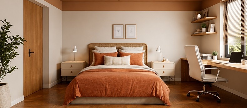
Many modern home interior design ideas move beyond traditional bright white woodwork, instead using painted finishes that blend seamlessly with the overall colour palette. Coordinating doors, skirting boards, architraves, and window frames with the surrounding colours creates a more refined appearance while reducing the visual breaks that can occur around the room.
Popular approaches include:
- Matching woodwork to the surrounding wall colour.
- Using slightly darker trim colours to add subtle definition.
- Choosing soft neutral finishes for a timeless appearance.
- Coordinating doors with kitchen cabinetry or fitted furniture.
- Keeping the same woodwork finish throughout connected rooms.
Treating woodwork as an integral part of the overall colour scheme helps create a cleaner, more cohesive, and contemporary interior where every element works together to enhance the finished design.
How to Test Before Committing
Even colours that appear perfect on a sample card can look completely different once they are applied to actual walls. Factors such as natural daylight, artificial lighting, surrounding furniture, and existing finishes all affect how wallpaper and paint are perceived at different times of the day. Testing your chosen materials before making a final decision is one of the most effective ways to prevent costly decorating mistakes.
Paint swatches, showroom displays, and online mood boards are excellent sources of inspiration, but they cannot accurately reflect the unique lighting conditions within your own home. Colours often change depending on the direction of natural light, the type of artificial lighting used, and the finishes already present in the room.
For this reason, professional designers almost always test wallpaper and paint samples together in the actual space before finalising a colour scheme. Seeing the materials in their intended environment provides a much more reliable basis for making design decisions.
When testing finishes:
- View samples during both morning and evening light.
- Position wallpaper samples alongside painted boards.
- Compare colours under your home’s artificial lighting.
- Consider how nearby flooring, furniture, and fabrics influence the overall look.
- Leave the samples in place for several days before making a final decision.
Spending time assessing wallpaper and paint in your own space gives a far more accurate impression of how the finished room will look, helping you choose a colour scheme that feels balanced, cohesive, and right for your home.
Conclusion
The best wallpaper and paint ideas are not created by selecting attractive colours in isolation. Instead, they come from carefully coordinating wallpaper, paint, and the way a room is intended to function. From choosing the most effective feature wall to considering colour temperature and the scale of patterns, every design decision plays a role in creating an interior that feels balanced, cohesive, and visually appealing.
Thoughtful interior space planning ensures that wallpaper complements the architectural features of a room rather than competing with them, while carefully selected wall color combinations bring every element of the design together. By drawing inspiration from proven modern home interior design ideas and taking the time to test wallpaper and paint samples within your own home before decorating, you can create interiors that feel harmonious, well-planned, and professionally designed, delivering a timeless look that will remain stylish for years to come.
FAQs
What is the best way to combine wallpaper and paint in the same room?
The most effective wallpaper and paint ideas use wallpaper as the focal point while selecting paint colours from its existing palette to create a cohesive design.
How do I choose wall color combinations that work with wallpaper?
Choose one of the wallpaper’s secondary tones and repeat it on surrounding walls. This creates balanced wall color combinations without competing with the pattern.
Is one wallpapered wall enough?
Yes. In many rooms, particularly smaller spaces, a single feature wall provides visual interest while maintaining a light and spacious feel.
Why is interior space planning important when using wallpaper?
Good interior space planning helps identify the strongest feature wall, balances patterns with furniture and ensures decorative finishes support the room’s layout.
Should ceilings and woodwork match the walls?
Not always, but coordinating ceilings, skirting boards and doors with the overall colour palette creates a more unified finish and reflects many modern home interior design ideas.


